Monday, May 13, 2013


Second Life Final
Although this avatar looks really creepy, I think it accurately represents my lack of sleep.  to create this avatar i modified the body shape to be anorexicly skinny so that it would not poke through  the clothing, since secondlife wound not let me wear multiple alpha layers at once.
"Realistic" self


Second Self
Creating the second self was the hardest part of the entire class in my opinion.  After learning maya, second life's user interface is extremely limited and difficult to work with.  For this avatar I recreated my favorite graffiti artist's character swampy. I made the entire avatar by using the build tool then attaching the various parts to each part of the avatar's body then repositioning them.  The hardest part was figuring out the values to cut, hollow, and cut the edge of the ribs.  It was also difficult to create the second horn on the head and make it look right as there is no reflect tool in second life.  Overall I am happy with how it came out, it was satisfying to create the whole avatar myself as at first I was just planning on doing the head.


Monday, May 6, 2013

3-D The Sequel 
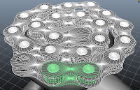
For this rendition of my sculpture I used the program maya. After fiddleing around with sketchup for a bit I came to the conclusion that that program would not be capable of creating the sculpture as accurately as I had wanted. So I decided to learn maya and after spending more than half the allotted time for this project watching tutorial videos I can say that I know less than a third of the features that  maya is capable of.  The most difficult part of the sculpture was making the shards of glass.  It was difficult make them have defined faces with out having any hard square edges. This project has really inspired me to see what I can do with maya after seeing the enormous capabilities that it is capable of.


Monday, April 29, 2013

The Language of New Media -Manovich Reading Questions:

Do you agree with Manovich that virtual reality technologies will cause us to devolve to such a state that we will be communicating with each other by gestures, body movements and grimaces? Is our current virtual communication through email, and text messaging a step in this direction?

Do you really think that if the free external thinking space that Manovich describes actually comes to be that it will be regulated?  Could this eventually become the end of free thought?

Emily Rodgers –In search of
            In Emily Rodgers' mfa thesis exhibit She focuses on houses and their intiors , particularly in the Reno area west of wells.  All of her pictures in this exhibit do not contain any people, forcing the viewer to focus on the space, forms, and lines that the buildings create.  In her thesis presentation she explained how she likes to show hints that people have lived in these houses without actually showing the people.  She accomplishes this by including details such a dent in the wall, wear patterns in a carpet, and tire tracks in the snow in her photographs.  She is interested in finding a story but leaving some parts of it unanswered. 
            In here thesis presentation she talked about her method of finding homes to photograph.  She would look through old newspapers and look for events that happened in the particular neighborhood she was interested in.  She would take advantage of the fact that old newspapers used to print the addresses where things happened and she would revisit the houses.  She would explain to the owner what had happened there and often the owners of the houses would be intrigued and let her take pictures of their home. 
            My favorite work in this exhibit (Unknown name) is of a window sill that is painted white and the paint on the top has been worn away to expose the green and brown layers under the white.  There is a light ray and shadow being cast by an unknown source  that creates vertical lines in the scene and some interesting tonal gradients.  The only lines in this piece are horizontal and vertical lines giving the piece a Piet Mondriaan feel. 
            Another piece in this exhibit I found interesting is of a door with light shining through the edges.  This piece has many subtle details that suggest a story, yet like Rodgers wanted, the full story is left untold leaving the viewer searching through the photo for more.  There is a wearing in the carpet that suggests that this scene has been through a lot of repetitive foot traffic throughout the years.  The blinds in the window hang down crooked showing their age.  The dirt on the door hints that little kids live (or lived) in the house.  And the light creeping around the edges of the door suggest that outside of this old musty house it is a nice and sunny day.  These details definitely tell a story, although it may not be entirely clear, which serves to peak interest in the viewer. 
            Emily Rodgers exhibit “In search of” is an interesting and well-put together body of work.  All the images in this gallery fit together and compliment each other nicely.  Rodgers was very successful in accomplishing what she set out to do: to tell parts of a story, while leaving just enough out to make the viewer interested.
Persuasion by Priscilla Varner

The exhibit Persuasion by Priscilla Varner is a collection of photographs accompanied with six words next to each photograph.  In a short note in the gallery, Varner addresses the subtle forms of persuasion that we are bombarded with throughout our day by advertising that we usually don’t take notice to.  She explains that her goal in this photographic series was to show how the persuasive tactic of word choice can effect a viewer or reader.  By placing certain word along side her pictures, she is hoping that the words will “persuade” the viewer to interpret the image differently than they may have if they just looking at the image by itself. 
            “Visiteurs Musee”  appears to be a photograph of a group of people in an art gallery.  The black and white print has black vignetteing  around the border drawing the viewers eyes to the silhouetted figures towards the middle of the picture.  The lines on the ceiling and floor create leading lines that draw the viewers eye to the silhouetted people as well.  Most of these figures appear to be in motion because their feet are frozen mid-step.  The figures closest to the photographer, being significantly shorter than everyone else in the room and wearing a baseball hat, appear to be kids.  One of these kids is crouching with his arm out stretched towards the other kid as if they are playing tag.  When simply looking at the image the viewer gets the impression that the image is about a group of people moving through an art gallery with their kids playing, but after reading the words that Varner has placed next to the image the viewer gets a dramatically different idea of what is going on in the picture.  The words “darkness, distress, evacuation, exit, swift, trepidation” printed to the right of the picture instantly change the mood in the picture.  All of the people that once seemed to be taking normal relaxed steps now seem to be walking quickly to the door.  The kid that once appeared to be playing tag with his friend now seems to be grabbing the other kid, pulling him towards the exit.  The room that at first seemed to just be a naturally lit art gallery has now turned into a dark, panic filled room.  The effect that these six words have on the way the image is interpreted is dramatic; completely changing the mood from relaxed to chaotic.  It is fascinating how a few descriptive words can impact the atmosphere of an image in such a severe way, persuading you to interpret the image in a completely different way from how you had previously imagined it.  All of Varner’s images in this exhibit are accompanied by words of persuasion, but this image in particular really struck me with much you can be persuaded by a few words.  These words more so than any others in the set completely changed how I interpreted the photograph. 
            The pictures by themselves do not seem to relate to each other at all but their accompanying words serve a dual purpose by tying the exhibit together.  These words in a way turn the gallery into an internal psychological experiment for the viewer, allowing them to watch their thoughts to be persuaded one way and another by the words and images. 
Two by Land: Katherine Sandoz and Nicole Donnelly

        Nicole Donnelly’s painting style is very abstract and surreal.  She uses very organic shapes and textures to suggest unusual surreal landscapes.  In some of her paintings it appears that she begins painting the canvas upside down, and flips it at some point during her painting process to finish painting the image.  This is made apparent by drips of paint that appear to be dripping up.  This subtle feature provides an interesting effect to the physics of the painting almost making it seem like she could have been in outer space, painting landscapes that actually exhibit. 
            “The Floating World” is one of her larger paintings and definitely the most visually interesting piece in my opinion.  Donnelly depicts floating dark green bush/cloud like objects that are held down with orange nets.  These nets are tied down by a white rope that descends and disappears into the light blue water below.  The artist gives subtle hints that the blue bottom third of the painting is water by including dark lines that mirror the white lines that hold down the nets.  She also depicts distorted green masses directly under the floating green clouds creating a reflection effect.  There are also two pinkish hieroglyphic-resembling bodys that serve to add interest to the negative space behind the white lines.  These strange symbols add a mysterious element to the painting because it is unclear what they are and, they don’t have reflections in the water making them seem almost like ghosts.  These symbols do an excellent job of guiding the viewer’s gaze around the landscape from floating cloud to floating cloud, to the water and back again.  Another element that I think is interesting about this piece is the space between the top of the green cloud and the orange net.  The space between the two makes it seem as if there is an invisible form on top of the cloud that is holding up the net.
            Katherine Sandoz’s style is much more abstract, painting semi transparent wedges of color on wood panels.  Her paintings appear to be landscapes as well although with content this abstract, there is a lot open for interpretation.  Most of her paintings are extremely similar looking due to their simplicity.  The transparency of the color wedges creates an interesting effect resembling wet paper cutouts that are stacked on top of each other. 
            In her “Overpass Series” she features 9 square paintings arranged in a 3 by 3 square.  These 9 pieces exhibit differently placed and colored wedges with varying degrees of transparency.  Individually these paintings are interesting because of their watery textures and subtle depth created by the layered wedges and some sort of resin.  When you step back and look at these paintings collectively as a series, new interesting things start to emerge.  The 3 by 3 square of smaller paintings takes on a windowpane effect and it appears as if each window is a view to a different world.  At this distance only the general shapes are visible and a lot of the watery textures seem to disappear. 
            Together, I think each artists’ work compliments each other nicely. There somewhat similar abstract style ties the exhibit together while their displaying the two artist’s work side by side highlights distinct stylistic differences.  By displaying their work together it becomes second nature to the viewer to compare them, encouraging them to notice the details that make each work unique.

Sunday, April 28, 2013

Artist Research Project

         Artists have the ability to show the viewer different ways to view the world. Some choose to alter how we see the world, while others create entirely new worlds. Two artists that create these new worlds and alter how we see the world are Larry Carlson and Yoshi Sodeoka.
         Larry Carlson is a multimedia contemporary artist who works out of New York City.  He works in a large variety of mediums including traditional paper collages, programming, digital photo manipulation, flash video, interactive pictures, gif images, movies, and sound effects.  Before being introduced to digital media he created images in a similar style by cutting and pasting images he found in books and magazines (F.A.Q.). He is inspired from many sources including psychedelics, cryptozoology, the occult and the paranormal (Art Uncovered).  In an interview he described on of his most influential events as when he took a large dose of LSD on a mountain and met “mountain gods” who have been giving him artistic ideas and inspiration ever since (Art Uncovered).  Carlson also gets a lot of inspiration from ancient cultures such as the Ancient Egyptians, The Native Americans, and particularly the Mayans. Carlson has spent a good amount of time exploring ancient Mayan ruins all over the Yucatan peninsula.  Carlson’s influences from these ancient cultures is very prevalent in his work, he often includes pictures of humans with animal heads and strange combinations of animals in a cave painting like fashion (Graphic Artwork).   Carlson usually creates his artwork in small sections at a time, rarely having a set vision for a piece.  Because he works in this way, it can sometimes take him up to several months for all the pieces to come together in the finished piece.  
             “Red Hawk Barn” is a flash video that viewers can interact with by moving their mouse around and clicking on different objects in the landscape.  This video features a red barn with snowflakes moving around the scene as well as music/sound effects created by Carlson.  Some of the features of this interactive video include: If you click on the sky to the left of the barn  you are thrown into a world of flashing colors for a few seconds, then a symbol of a bird appears and you are back to the barn.  If you move your mouse to the bottom left of the screen an image of a woman with a hawk head appears, if you click on this figure, you are taken to a different scene with a bubble-like pattern for the ground that has pictures of clouds on it.  Small space ships fly over these bubbles and then words “Sky Land 7” quickly flash on and off the screen, then taking you back to the red barn.  When you move your mouse to the top right corner of the screen an image of a snowflake appear, as well as a color changing bird in the cut-out on the barn.  Clicking on the snowflake will make an image of a spinning snowflake appear on the screen with a voice saying “there was once a flake of snow” after which you are taken back to the scene with the barn. 
      Many if not all of the elements in this video seem random with the only overarching theme being that of the hawk and the snow.  Creating unanswered questions is a common thing that Carlson does in his artwork which I believe is an essential part to his psychedelic style.  By introducing elements that don’t necessarily have purpose or explanation, he makes the viewer wonder and keep searching through the work for an explanation. Another way that he goes about exhibiting his psychedelic style is through rapidly changing colors which can be seen when you click on the water drops when you move you mouse near the door to the barn.  In an interview he said he “wanted to create an interactive digital drug” (Art Uncovered), an ambition that I think he successfully accomplished.
           

       Yoshi Sodeoka is a digital media artist from Yokohama, Japan. Sodeoka now lives and works out of New York City. Sodeoka studied art and design at the Pratt Institue in New York and was the founding art director of Word Magazine (Bio, Contact Info, Press, CV.).  The majority of Sodeoka’s works are psychedelic still images and videos that rely on shifting colors and geometric patterns, instead of creating new psychedelic worlds such as Carlson does.  Sodeoka often lacks a theme in his work, usually creating overwhelmingly colorful images that are distorted beyond recognition of the original image. 
        In “ASCII Bush”, Sodeoka puts George H. W. Bush’s and George W. Bush’s State of the Union addresses through a visual text filter. With this filter the audience sees the images of the addresses as colored text against a black background. He also uses an audio filter to distort the videos’ soundtracks. Although these videos are visually similar, Sokeoka creates a substantially different atmosphere by using different audio filters. In the video of Bush Sr.’s address, Sodeoka uses a harsh audio filter, which makes him sound like an evil droid off of Star Wars. The sound of the crowd cheering turns into an unsettling electronic buzz. In Bush Jr.’s video, Sodeoka uses a much less threatening auto-tune-like filter. This filter makes the sound of the crowd cheering into a glittery ringing noise. These audio filters bring different connotations to the veiwer. While the video of George Sr. sounds dark and scary, the video of Bush Jr.’s State of the Union Address is lighter and whimsical. Sodeoka also uses color to create different atmospheres in his videos. Using red text to accompany the harsh filter of Bush Sr. video helps create a more negative vibe for the viewer. The blue text along with the light auto-tune audio filter gives a calmer and less agitating vibe. Another thing that may contribute to the differing atmosphere is the original content of the presidential speeches. Bush Sr.’s address is about the grim details of war in Operation Desert Storm, while Bush Jr.’s addresses lighter topics such as tax reform, health care, and employment.
            It is important for the viewer to understand some of the important aesthetic decisions behind Sodeoka’s “ASCII Bush”. Sodeoka includes the multiple defintions of the word “recycle”, hinting at his intent of recycling old media to make new art. One of the ways Sodeoka recycles these videos is by not editing the original video. Sodeoka explains, “The speeches are not edited--just digitally filtered. And like I said, they are very lengthy. ASCII BUSH is definitely boring enough to be interesting!!!” (ASCII Bush, 2004).  By using filters instead of editing, Sodeoka is able to preserve the original content, but creates a new experience for the viewer. 

        
Both of these artists recycle old media sources to create new art, however, Sodeoka and Carlson differ in the way they choose to recycles the old media. Carlson recycles media by editing images and audio that he collects from a wide variety of different sources (F.A.Q.). Carlson animates these different things to create an interactive viewer experience. Sodeoka gets his media from a less varied source within the same context (the original speech videos) and only uses filters to create his art. Sodeoka does not allow for the viewer to contribute to his art. Instead, Sodeoka creates a finished product for the viewer of real life where the viewer has no choice in personal interaction with the artwork.  Both Carlson and Sodeoka alter previously normal views of reality to create their own interpretations of the world.
     According to Manovich, both of these videos are interactive in that they are digital information that can be manipulated but only Carlson allows for his viewer to take part in his artwork as “co-authors” (Manovich), by having them physically interact with the media by navigating through the work with their mouse to achieve an experience that is unique.
On the other hand, according to Participative Systems, Carlson’s “Red Hawk Barn”, is more reactive than interactive because “…a human presses keys… and the machine or the computer program reacts” (Participative Systems). The act of the viewer clicking and moving the mouse around result in pre-programmed reaction that Carlson has set in place. In order for these works to be considered “participative”, the viewer would have to have some type of input that is recorded (Participative Systems).
        These two digital media artists may both use digital processes to create their media, but their styles and specific process for creating their art result in completely different finished products.  The fact that these artists recycle old media to make art may be a similarity, but the process that they digitally manipulate the media with is where each artist's styles truly emerge.


 Works Cited
Manovich, Lev. The Language of New Media. San Diego: MIT Press 2001, 2001. 29-41. Print. <http://art245spring13.blogspot.com/2013/04/final-reading-manovich-language-of-new.html>.

"Chapter 5/ Participative Systems." N.p.: n.p., n.d. 111-24. Print.

"GRAPHIC ARTWORK." THE WONDERFUL WORLD OF LARRY CARLSON. N.p., n.d. Web. 20 Apr. 2013. <http://larrycarlson.com/black-and-white-illustrations/>.


"F.A.Q." THE WONDERFUL WORLD OF LARRY CARLSON. N.p., 2013. Web. 20 Apr. 2013.

Thomas. "Art Uncovered." Art Uncovered. N.d. BreakThru Radio. Web. 20 Apr. 2013. <http://www.breakthruradio.com/#/post/?blog=64&post=15&autoplay=1>

Sodeoka, Yoshi. "Bio, Contact Info, Press, CV." Sodeoka.com. N.p., n.d. Web. 20 Apr. 2013. <http://www.sodeoka.com/Bio-Contact-Info-Press-CV>.

"ASCII BUSH." ASCII BUSH. N.p., 2004. Web. 20 Apr. 2013. <http://turbulence.org/spotlight/ASCII_BUSH/>.

Monday, April 8, 2013

Assemblage Sculpture

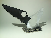
 For this project I created a sculpture reflecting me and my hobbies because my hobbies reflect some of the things in life that I enjoy most. I chose to have everything protruding from the half-sphere because these object/hobbies themselves do not compose who I am, instead they are extensions, certain areas of life that I have chosen to expand upon and pursue.  The shards of sea-glass (intended to resemble crystals) represent my interest in geology. Geology is fascinating to me and is becoming a bigger and more important part of my life as I work towards my degree in geology/geological engineering.  The knife blade is included in my sculpture because I collect pocket knifes specifically those made by the company Spyderco. the knife blade featured is a Spyderco paramilitary which is out of commission because of its broken tip. Lastly the assemblage sits on a bike chain, symbolizing how I am always on my bike. Whenever I get the opportunity I love to ride my bike around town and explore.


Monday, March 25, 2013

Crowdsoursing discussion questions

(1) In the article Crowdsourcing: The art of a crowd,  Carol Strickland maintains that crowdsourcing
"erases the line between artist and audience".   Including the audience to this degree may put the final project at risk to irreverent or poor quality submissions.  In this artform, should a certain amount of screening be done with submissions or does that subtract from the origional purpose of crowdsoursing?


Crowdsourcing

For my conceptual crowdsourcing project I wanted to exploit the world wide accessability of the internet to create a collection of artwork from all over the world. In addition to the collection this project would also contain multiple murals put together by thousands of participants.  Participants would create a small section of the mural through a program similar to Adobe Illustrator and Photoshop that would be available for free on the website.  When put together, these murals would create a multi-layered gallery around the hard drive. Finally, this gallery would be encapsulated and launched into space on a calculated safe trajectory that would be safe from collisions with space debris. The purpose of this gallery is to preserve for as long as possible the art and creative history of our planet, which in the grand scheme of the universe live extremely short lives.


Crowd sourcing participation


(1)  Dear Photograph

Dear Photograph, 
This picture was taken when my girlfriend first got her car.  Now her car is slowly dying part by part and it is time for a replacement.  Thanks for many miles traveled,
Aaron


(2) A Man With a Movie Camera


For this submission I recreated some of the opening scenes to A Man With a Movie Camera. Unfortunately there were some technical difficulties with uploading and the video is upside down.


(3) Young Me Now Me

The young me picture is of me and my sister hiking to Vernal Falls in Yosemite in 1999.  Last summer we visited Yosemite again and recreated the picture.


Monday, March 11, 2013

Stephen Beck Illuminated Music

Stephen Beck reenactment from Aaron Beck on Vimeo.
http://www.ubu.com/film/beck_illuminated.html

 Stephen Beck and Warner Jepson's Illuminated music is an abstract art video that features moving lines and shapes that constantly change color and texture.  These are animated to various synthetic sounds that are also constantly morphing along with the shapes.  To recreate the shapes I filmed various lights shapes and textures and then used after effects to manipulate the video clips to resemble Beck's shapes on a black background.  I love the psychedelic quality of the original, so I incorporated that trait into my interpretation, as well as synchronizing the animation to Jepson's music. 

Monday, February 25, 2013

Bishop Claire-Digital Divide Discussion Questions

1. Does modern contemporary art's hushed relationship with digital art suggest that digital art may never be an acknowledged media by the mainstream art world? Or does it have to wait its turn to become outdated for it to be accepted and "fashionable"?

2. Do you think the mainstream art world's lack of interest in digital art comes from the common misconception that computer based media can be made with ease at the touch of a button? Could their opinion be as simple as a misconception or are there other factors at play? If so what could they be?

Monday, February 11, 2013


Apocalypse Animation from Aaron Beck on Vimeo. Through our continuous burning of fossil fuels, our polar ice caps are getting smaller and smaller leading to some very unhappy polar bears. When the polar bears' extra terrestrial cousins learn of this, they travel to earth to destroy us all.

Monday, February 4, 2013


Choose Your Fate

There are many different hypothisies as to how the world will end, each with little more likeliness than any other. How you choose to prepare for the apocalypse is up to you. It is important to keep in mind that certain life styles may hasten the coming of the apocalypse, whether it be through the slow accumulation of carbon dioxide in our atmosphere or the accidental melt down of a nuclear reactor,
Choose Your Fate.

Sunday, February 3, 2013

According to Benjamin, "There is no such place for the movie scene that is being shot. Its illusionary nature is that of the second degree, the result of cutting. That is to say, in the studio the mechanical equipment has penetrated so deeply into reality that its pure aspect freed from the foreign substance... The equipment-free aspect of reality here has become the height of artifice; the sight of immediate reality has become an orchid in the land of technology." What does this say about the relationship between art and reality?

The evolution of art technologically has brought with it the ability for certain mediums such as photography to be reproduced relatively easily. Does this ease of reproduction make the work any less valuable than if there is only one copy? Does mass producing art take away from the original intent?